

There’s a tension at the heart of almost every software product: the more powerful it becomes, the harder it is to use. Features pile up, menus grow, and what started as a clean interface turns into something that requires a manual to navigate. For development teams, this creates a genuine dilemma—strip things back and risk frustrating power users, or keep everything and overwhelm everyone else.
The good news? It’s a false choice. Software usability and functionality don’t have to compete. The best products in the world—think Figma, Notion, and Slack—manage to pack an enormous feature set into experiences that feel intuitive, not intimidating. The difference comes down to design philosophy, user research, and a willingness to make hard decisions about how features are presented, not just which features exist.
This post breaks down exactly how to improve software usability without gutting the functionality your users depend on. From conducting meaningful software analysis to learning from software ratings and performing honest software comparison, you’ll walk away with a practical roadmap for building products that are both powerful and a pleasure to use.
Why Software Usability Problems Are So Easy to Miss
Development teams spend more time inside their products than anyone else. That familiarity is a double-edged sword. Features that seem obvious to a developer can be completely opaque to a first-time user—and by the time complaints surface through software ratings or support tickets, the damage to user retention is already done.
Usability problems tend to accumulate quietly. A modal here, an extra click there, a label that made sense six months ago but no longer reflects what the feature does. No single decision breaks the experience. Instead, it’s the compounding effect of small compromises that turns a once-clean product into something bloated and confusing.
The first step is acknowledging that usability isn’t a final polish applied at the end of a development cycle. It’s a continuous discipline—one that requires structured software analysis, real user feedback, and a clear framework for making trade-offs.
What Does Software Usability Actually Mean?
Software usability refers to how easily and effectively users can interact with a product to achieve their goals. It’s typically measured across five dimensions: learnability (how quickly new users get up to speed), efficiency (how fast experienced users can complete tasks), memorability (whether returning users remember how to use it), error rate (how often users make mistakes), and satisfaction (how much users enjoy the experience).
Functionality, by contrast, refers to what the software can do—its features, integrations, and capabilities. The misconception is that adding functionality inherently reduces usability. In practice, the problem isn’t the features themselves—it’s how they’re surfaced and organized.
How to Conduct Software Analysis That Reveals Usability Gaps
 Before making any changes, you need a clear picture of where your product stands. Software analysis for usability purposes goes beyond bug tracking. It involves examining how users actually move through your product, where they slow down, and where they give up entirely.
Start with session recordings and heatmaps
Tools like Hotjar and FullStory allow you to watch real user sessions, see where clicks cluster, and identify the moments where users abandon a workflow. This kind of behavioral data is far more revealing than survey responses alone—users often say one thing and do another.
Map user flows against intended paths
Take your most critical workflows—onboarding, core task completion, settings configuration—and map what users actually do against what you designed them to do. Gaps between the two are almost always usability problems in disguise.
Run moderated usability tests
Quantitative data tells you where people struggle. Moderated tests tell you why. Recruit five to eight participants who represent your target user, give them specific tasks to complete, and observe without guiding. The moments of hesitation, confusion, and error are your most valuable design data.
Audit your information architecture
A cluttered navigation structure is one of the most common sources of poor software usability. Conduct a card sort exercise with users to understand how they naturally group features, then compare that to your current architecture. Mismatches here explain a lot of “I couldn’t find it” feedback.
Learning From Software Ratings and User Reviews
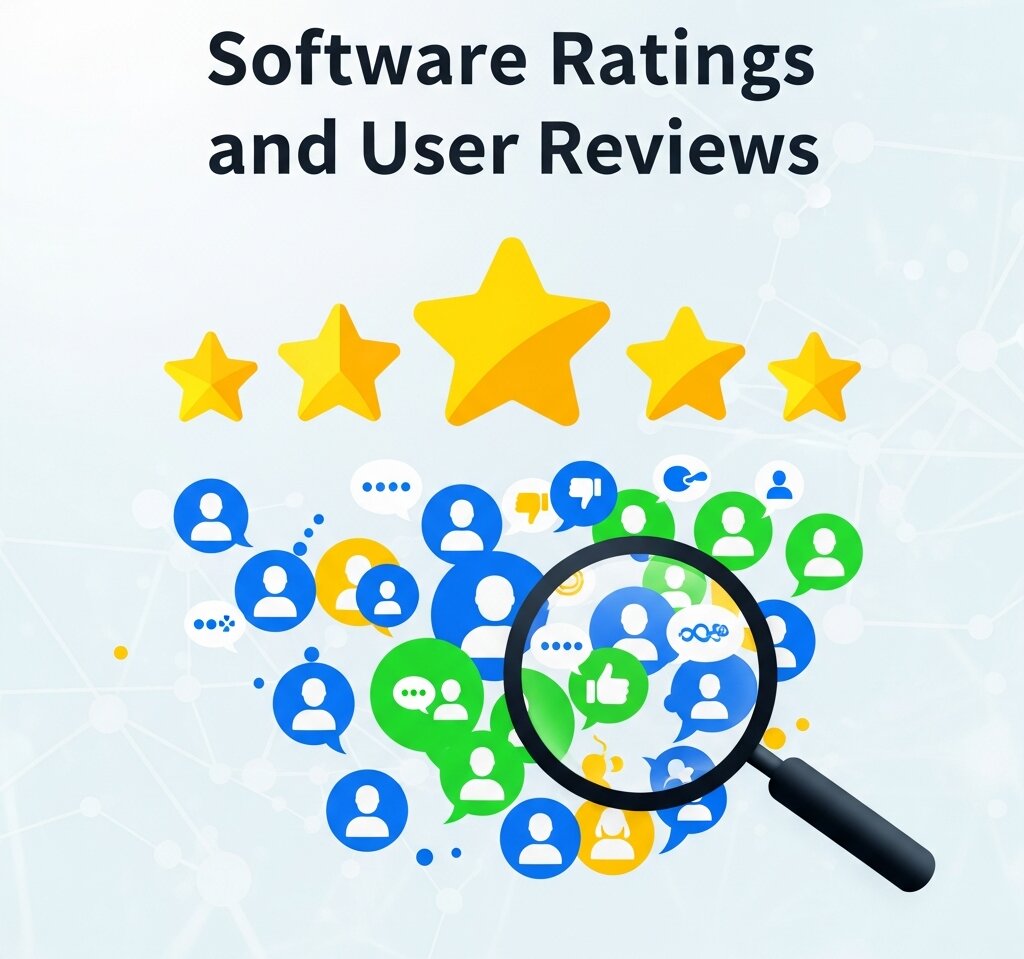 Software ratings on platforms like G2, Capterra, and Trustpilot are an underutilized source of usability intelligence. Most teams scan them for sentiment. Few analyze them systematically.
Filter reviews by rating (focus on 2–3 stars, not just 1-star) and look for patterns in the language users use. Are there recurring mentions of specific features being “confusing” or “hard to find”? Do users praise your functionality but qualify it with “once you figure it out”? That qualifier is a usability problem.
Competitive software comparison is equally instructive. Look at how users describe switching from your product to a competitor, or vice versa. What made them leave? What brought them back? The language users use in these reviews is often a direct window into unmet usability expectations—and it can highlight specific workflows where a competitor has solved a problem you haven’t.
One practical approach: build a review tagging system. Assign team members to read and tag every new review by theme (navigation, onboarding, feature discoverability, performance, etc.). Over time, this creates a ranked list of usability pain points grounded in real user language.
The Principles Behind Improving Usability Without Reducing Functionality
With a clear picture of where the problems are, you can start making targeted improvements. These principles are what separate products that genuinely improve usability from those that accidentally simplify themselves into irrelevance.
Progressive disclosure: show less, offer more
Progressive disclosure is the practice of revealing functionality gradually, based on user context and expertise. Instead of displaying every option upfront, you surface the most common actions by default and make advanced features accessible—but not intrusive.
A strong example of this is Google Sheets. The default toolbar covers 90% of what most users need. Advanced features like data validation, custom scripting, and pivot tables are readily available, but they don’t clutter the baseline experience. The functionality is all there—it’s just organized around how often it’s used.
Contextual help and inline guidance
One of the most effective ways to reduce the learning curve without removing features is to bring explanations to the user, rather than sending them to a help center. Tooltip overlays, inline guidance, and contextual empty states (explaining what a feature does when it hasn’t been used yet) all reduce cognitive load without removing capability.
Smarter defaults
Default settings shape the experience for the majority of your users. A default that’s wrong for most people creates friction even before they’ve customized anything. Review your defaults critically: are they optimized for first-time users or for power users? Ideally, they should serve both—starting simple, with customization available for those who want it.
Consolidate redundant pathways
Feature creep often creates multiple ways to accomplish the same task—some of them better than others. When you identify redundant pathways through software analysis, consolidate them. This reduces decision fatigue without removing any actual functionality.
Separate configuration from daily use
Advanced settings and configuration options don’t need to live where users spend their time every day. Separating “set it and forget it” functionality from core workflows keeps interfaces clean without burying features users genuinely need.
How to Run an Honest Software Comparison Against Best-in-Class Products
Benchmarking your own software usability against competitors isn’t just about feature parity—it’s about understanding the experience gap. A structured software comparison examines how long it takes a new user to complete a core task in your product versus a competitor’s, where users get stuck in each product, and how each product handles error recovery.
The goal isn’t to copy what competitors do. It’s to understand the baseline your users are operating against. Users don’t compare your software to nothing—they compare it to every other piece of software they’ve used. When they call something “confusing,” they often mean “more confusing than what I’m used to.”
This kind of benchmarking works best when it’s conducted with users who have direct experience with both products. Their friction points in your software—especially when they don’t experience the same friction elsewhere—are your most actionable usability improvements.
Measuring the Impact of Usability Improvements
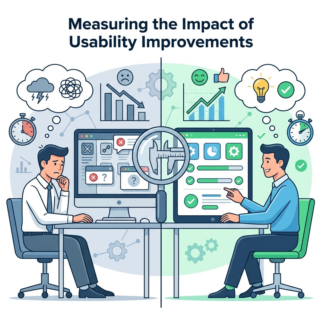 Improving software usability is only half the work. Measuring whether changes actually made a difference closes the loop and prevents regression.
Key metrics to track include:
- Task completion rate: The percentage of users who successfully complete a defined workflow without assistance
- Time on task: How long it takes users to complete a core action—improvements here compound over thousands of sessions
- Error rate: How often users make recoverable and unrecoverable mistakes
- Support ticket volume: A reliable proxy for usability problems, especially when tickets are tagged by feature
- Feature adoption: If a feature is underused, it may be a discoverability problem, not a demand problem
Track these before and after each change. When your software ratings begin to improve and qualitative feedback shifts from “once you figure it out” to “easy to use,” you’ll know the changes are landing.
Where to Go From Here
Software usability is never finished—it evolves alongside your users, your product, and the expectations set by the broader software landscape. The teams that build the most usable products aren’t those who compromised on functionality. They’re the ones who invested in understanding their users deeply enough to present powerful features in ways that feel effortless.
Start with a structured software analysis of your three most critical user workflows. Map what users actually do, run a handful of moderated tests, and dig into your software ratings for patterns you might have missed. From there, apply progressive disclosure, smarter defaults, and contextual guidance to remove friction without removing capability.


